So, imagine that we are to do a poster of a product, say a pencil. What are the key elements that we can put on the poster? First we have a "title". Let us use the name of the product for the title. I shall use the name of my daughter, Keshia, as the product name. Then, we have a "sub-title". Usually, this is a slogan or a by-line to call the attention of the viewer. Then, there's the "illustration". Now, this is very important. You have to come up with a very catchy illustration or photograph so that passers-by would be drawn into the poster and stay awhile to look and get him/her to read the information. Next is the text or copy which is the actual information or message you want to get across. This part is usually supplied by the copywriter. When I was in college, we use to represent this with plain lines just so the printer would know where to put the text. Remember not to put very long sentences or paragraphs when the poster. Nobody will read very lengthy advertisements. Lastly, we have the company name or the logo.
Now that we know the parts, here are two examples. I used formal balance for the first example.

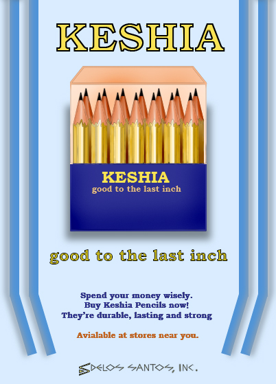
Notice that all elements are justified. Remember that formal balance is having symmetry of all the elements. What you find at the left, you will find at the other side. In computer lingo, it is "justified". This is a very safe ploy. You will never go wrong when you use this. The only thing you have to worry about is proper spacing and proportion. (Okay, I committed a boo boo here. Notice the flap? There is something wrong with it. Can you tell me what it is?) O di ba, may test pa. hehe
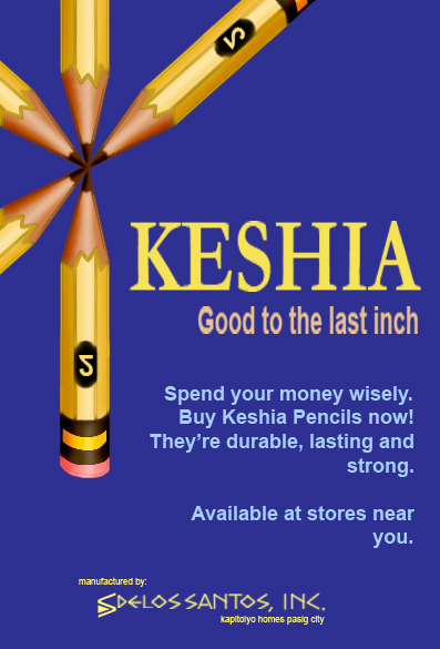
Now, compare the same elements using informal balance.
If you were the artistic director, what would you have chosen, if ever? Or would you rather that the artist create another one? Do you have another idea for a layout? Tell me about it.
I hope I was able to help someone out there with these simple tips on how to prepare a visual presentation.
24 comments:
hi there, i could tell u a thousand stuff, if only they were running through my head. unfortunately, i didn't sleep at all last night.. i just want u to know that i applaud your creativity :) your fabulous emails are sorely missed, rolly! have fun with your ideas.
hugs,
sophie
Sophie's Fair Thanks for the visit and the very encouraging words. Yeah, I've been remiss with my correspondences lately. Busy with a lot of work. Will have time to catch up later.
Sige I'll use my strategic planning eye for this one. Hehehe.
I like the 2nd layout. Love it. I'm just bothered by the short pencils. Long pencils will sell the product more and will give the impression of being more durable and being more long-lasting. Ah, playing with consumer's minds. ;)
I like the second one, too, Tito Rolly. Mas dynamic at catchy ang dating. :)
mas gusto ko rin yung pangalawa. erotic kasi ang dating sa akin eh. hehehe. sabagay, lahat naman sa akin eh erotic ang dating.
isa pa, mayroon kasi siyang magandang dating sa akin. huwag mo nang itanong kung ano yon. basta maganda. alam mo naman ako eh by feel lang parati. inaderwords, kapa ng kapa.
'yung ikalawa din... hahahaha kaya lang, hindi "2" ang nag appear sa lapis, kung di mirror image ng "2".
Toni That's a good point. It was supposed to be of a pencil extender e, kaya "good to the last inch" kaya lang malapit ng magtampo yung artist ko, (si Mickey) hindi ko na itinuloy yung extender. hehe Thanks.
Doc Emer That's what I'm saying about formal design. Safe pero hindi masyadong catchy no?
Batjay Why doesn't that surprise me? hahaha buti na lang hindi ka nag-elaborate. Me mga pumupunta ditong minors e. hehehe
sis Good eye. Yes, mirror image nga ng 2 yung lumitaw. meron pang isang mali yang una. hanapin mo pa. hehe
I like both of them. Mahilig ako sa justified but I also love informal ones. Parehong may kanya-kanyang appeal.
Happy Birthday Tito Rolly!
As the creative director of my agency, I give a thumbs-up on study #2, but would probably require several more studies for client (I prefer dynamic work). I agree with one of the early posts about short pencils, but I do like the creativity in the copy. This is a great series!
HAPPY BIRTHDAY TITO ROLLY!!!!!!!!!
tingaling Yes, each one has its own appeal.
Thanks for the greetings.
Dean Of course. Knowing your attention for detail and penchant for perfection, I expect you to ask for more studies done. Thanks for passing by.
As regards the length of the pencil, as i said earlier, the original idea was for a pencil extender. Hence, the by-line, "goog to the last inch". never mind, this is just make believe naman. hehe
Toni Thank you for the greeting.
Hi Tito Rolly! I remember you told me that your birthday is September but you didn't tell me the date ... now Ting has given you away but I hope I'm not too late. HAPPY BIRTHDAY!
PS I enjoy your art lessons. And I like the second poster more than the first one.
Hi titorolly,
UNA-HAPPY BIRTHDAY. Patas na tayo. late mo rin ako grineet noon. HAHAHA
SECOND- Ako dapat ang una ditong magcomment kaya lang nasa laptop ko ako at wala akong password sa aking blogspot account.
THIRD- ayaw ko sanang magcomment dahil no. 13 ako. Argggggggh
FOURTH: Salamat sa mga ganitong post. At least iba naman at magagamit ko ang archived kong utak noong ako ay corporate slave diyan sa pinas at e-jokeator. Sabi nga nio retz, siguro kung magseseryoso ako sa aking blog marami akong maituturo. Ano siya nababaliw eh di na ICU ako noh.
FIFTH- Ito na. sabi nga ng aking mga istudyent noon pag marami akong pasakalye, ibig sabihin niyan marami akong sasabihin.
Parang contribution ko lang.
1. Ang mali sa unang illistration:
Good to the last inch....na doble kasi siguro ang illust. na ito ay nagtatampok ng product na nasa box na at yong nasa poster.
Design:shape:
Box of the pencils lacks the form.
form includes height depth and width.
the pencils are in two rows but the box looks flat althought there is a shadow.
even the flap is short. if you want to project realism as to truth in advertising (that is what you is what you get) then this has to be portrayed in the ad.
Balance: although balance is important in advertising design, it should not be always symmetrical.
There is what you call radial balance..that is there is balance in some focal points.
remember the way the consumer reads...from left to right..down.
so the catchy design should be more on the left kagaya nang nasa second illustration.
yeah the short pencils suggest that the actual pencils are short.
that is what you call impression of the image.
kagaya ng pork n beans. tingin ng tao may pork pero pag bukas nila ng lata... kulangot pala dahil maliit lang.
Color
I like the color blue.
In advertising color plays an important role because of their significance.
Blue connotes reliability, trust and technology. So in business, the commonly used colors are blue , gray, teal and green.
Pink is feminine at joskoday.
Although the copy is not your concern, I like to say a bit about it.
You do not tell the consumers what they should do.
Good to the last inch.
Spend your money wisely.
Buy now....
They're durable, strong and lost lasting.
That slogan is for a brand of coffee.
Good to the last drop...-because you
tend to drink coffee to the last drop, if they are good.
But with pencils, you do not use them to the last inch. One is the impression that you are too poor to buy a new one.
Advise them to be wise? No way.
What characteristics do they look for pencils?
Reliability. When they are using the pencils, are they sure, the lead components and the wood components are not going to break?
Are the erasers good?
So the reliability, durability, long lasting are what you shall play up because quality is the primary concern of the pencil users.
The long lasting already suggests that they are good to the last inch.
Design: Graphic...
I do not know if it is feasible but I rather see one long pencil or half of the pencil writing KESHIA.
Good firm lines show how good the pencils are. In action.
Text:
The graphic speaks louder than the text. Text can be Durable, Reliable and Long Lasting.
Slogan:
What do you expect from a pencil.
It should write.
KESHIA
The pencil that writes....
Kasi may mga pencil na isang tusok mo pa lang sa papel, putol na.
Punta ka na naman sa sharpener.
Kaya dapat slogan doon. The pencils that break.
Btw kahit ito exercise lang, dapat may contact address.
Cath Hmm, that is a mouthful there. Ang dami mo ngang nakitang mali no? Teka, let me take a second look.
About the dimensions; when you look at an object directly, it does look flat. Tama, hindi dapat nakita yung pencils sa likod! Very good. What you failed to see, which i thought was obvious was the flap. Notice that there is only one flap. The fold suggests the thickness of the object. however, based on the front, it would seem that that is not feasible. mahirap ipaliwanag when written. Dapat me illustration.
Tama ka about the copy. Well, as i said, that is the concern of the copywriter. i only wanted to illustrate how and where it should appear. Re the addy, yung second design, meron, kasama ng logo. Wala nga lang phone number, bago pa yung company. Hindi pa nakakabitan ng linya. hehe
Salamat sa bati. Oo nga, huli din ako nun. Quits na tayo. hahaha
Galing ng magic pencil nyo ah, I better get hold of this myself :D Doing my usual rounds to Pinoy Teachers Network members. Have a good weekend!
sir! i like the second one. it's not conventional, and it somehow gives off a subliminal message...great for advertising! by the way, may tanong ako sa yo dun sa latest entry ko =)
hi, mr rolly...
guess everybody chose the 2nd one which is better. it's also my choice.
i was also late for the observations so i'd rather not comment na lang. some of the visitors had great observations.
i was also late for the greetings. anyways, belated happy b-day to you!
(been very busy lately, too)
Bugsybee Thanks for the greetings. Oo nga, ting seems to have given it away. i don't mind, though. hehe
Teacher Sol Thanks a lot.
joyce Just been to your blog. Sinagot ko na yung tanong mo.
Bing Actually, there's no deadline in giving feedback. I have received feedback to some old posts of mine and I still appreciate them. ;-)
Thanks for the greetings.
Uy, may tutorial pala dito. And I almost missed it! This is what I get for not coming here as often as I should... hehe.
I like the 2nd lay-out Tito. Mas attractive siya.
I have a question though, and for all I know you might have answered this is the other parts of this tutorial but I'm too lazy right now to do some searching... hehe. I was just wondering Tito, could the lay-out be dependent on the subject of the advertisement? Like, the informal lay-out was probably more appealing to me, knowing that the ad is about pencils. The formal lay-out was like seeing a box of crayola, which I can see anywhere. Nothing exciting there. But with the 2nd lay-out, mas may dating siya... almost playful, mas fitting for something like a pencil. Or maybe not? :D
Jet Ako din, hindi nakakapag-blog hopping. Halos hindi ko nga ma-update tong blog ko e.
Anyway, re your question. Syempre binabagayan din ng type of format ang bagay na ina-advertise. Tama ka. Dahil ito'y pencils, mas maganda kung playful ang dating. I would imagine yung formal design would suit a Hotel or a bank's ad. Kailangan kasi ma-feel mo yung security and formalism. But don't bet on it. That's only my opinion. Sometimes, my opinions don't amount to anything naman e. hahaha
Hello! Got here from PTN.
I like this entry of yours ( a la tutorial session). Gives me an idea how I can prepare my would-be EFL blog for my Ukrainian students. Thanks so much for that!
BTW, I like layout number 2.
jayred Hi! Welcome to my blog. I hope I've helped you with this one. That was my goal. Anyway, these tutorials will be posted in PTN, too. I'm just waiting for the right time. There are still entries from others that need to be published.
Thanks for the visit and the kind words.
i like the 2nd one better tito rolly.... the product name is the dominant theme with the product advantage clearly illustrated. I like the color scheme too.... like agains dark, so my eyes go straight to the pencils...hehehe...
sorry... i meant, "light-against-dark" scheme.
Post a Comment