One of the tasks given to teachers is the preparation of the classroom especially during the opening of classes. Not only that, they would be given assignments to display works of students, and occasionally design a bulletin board. What about those visual materials they have to prepare to aid the teaching of the lesson and hype it up a notch? All these require some knowledge in design, at least to a conscientious teacher, that is. Of course, one does not want to make sloppy work. Being an art teacher, I have been requested to do these things not only for myself but co-teachers as well. Since i am maintaining a blog and have not been inside a classroom for quite some time, I decided to share my little knowledge which I think would be most helpful to those facing the task of having to make a design for the school or even for just a class.
Allow me to start this off with color. Color is very important. When making a design, the important thing to remember is that it should be pleasing to the eye. Colors one must use should harmonize with one another. Often, you hear someone quip, "Somehow, the colors don't match!" When you hear this, you know that you failed to harmonize. There are people who have a knack for color. They have a good color sense. But what about those who don't? Don't despair for there are certain standards which we can follow so that we can never go wrong with our color choices.
Hence, I introduce to you the Prang Color Wheel. This is a device designed by Mr. Prang to guide us with color combinations. This is how it looks like:

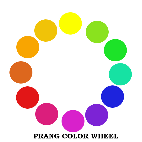
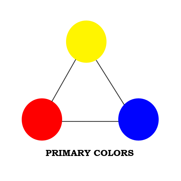
So, okay, now that you know that there is a color wheel, so what, you ask? The name of the colors as we know them, ex, red, violet, magenta, are called hues. Allow me to dissect this color wheel a bit. Let's start off with the very basic. We have three primary colors, viz., yellow, red and blue. These are called primary because these are the sources of all colors. We cannot produce these colors by mixing two or more colors. They are what they are. Let's present them in a triangle. Hence:
Now, what happens if we mix equal parts of two primary colors? Yes, we get secondary colors. These colors are orange (the mixture of red and yellow), violet (blue and red) and green (yellow and blue). Again, we can form a triangle to represent them.

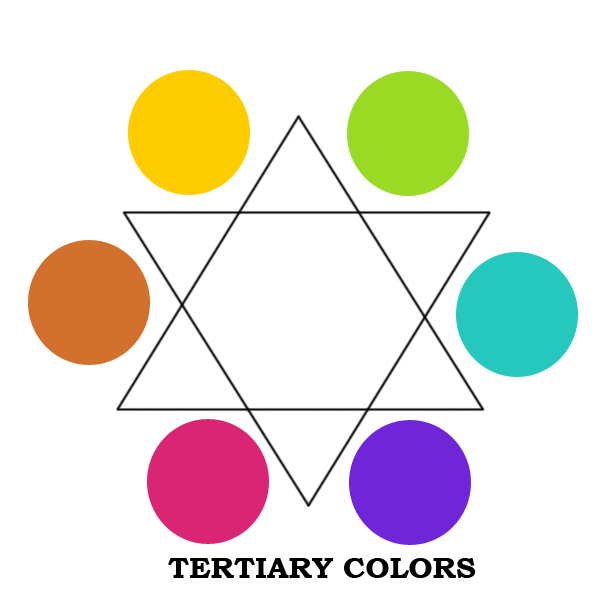
Now, let's make it even more interesting. What about mixing one primary color with a secondary color? Of course, we get a tertiary color. Some people call them intermediate colors but just for the sake of simplicity, convenience and consistency, let's call it tertiary. Now, the wheel is complete. No, not really. We can still go in-between these colors but I'll let you do the imagining from this point on.
I can almost hear you saying, "So what? Fine, now I know there exists a cute arrangement of color. But what does it do?" Here comes the important part. There are various ways by which you can use this color wheel. From this, we derive proper color combinations artists call color harmonies. Again, I am going to present to you the very basic of these color harmonies.
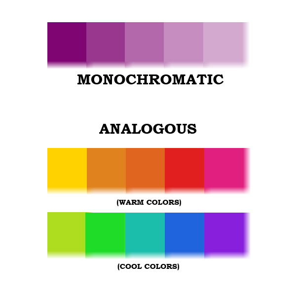
First one is called MONOCHROMATIC color harmony. Mono means one, ergo, choose a color and by either adding white or black, lessen or increase the intensity of the color.
Here, I have made five different "shades" or "tones" of one color. So, if you have a drawing of say, a landscape, use these different tones to create a painting. Divide a drawing into several parts. Assign a number to each of the tone. Set aside. Put numbers on the segragated areas making sure no two area of the same number sits side by side. Apply the tone to the numbered area and there you go! YOu have made a monochromatic painting of a landscape.
Next one is called analogous harmony. Analogy means relationship. Thus, these are colors that are related to one another. Take a look at the color wheel again. Notice that colors to the left of yellow and violet viz., YO, O, RO, R, and RV come from one primary color which is red. On the right side, YG, G, BG, B and BV, the common color is blue. See the relationship? The colors to the left of yellow and violet are called "warm colors" while those to the right are called "cool". I shall let you decide which set would be suitable for what design. Just like the monochromatic harmony, what you can do to a drawing is segregate the areas into five to six numbers and assign each area a number. Apply the color and voila, you have a painting that uses analogous harmony. So, you ask, "what are yellow and violet? Cool or warm?" They are neutral colors!
Lastly, we have complementary colors. These are colors that lie opposite each other. They are called complementary because they somehow complete the color wheel. What do I mean? Remember how the colors are related to one another? Those in left being related because they all have a portion of red. However, they do not have any blue! So, in order to complete it, get the opposite color. Hence, orange and blue are complementary. So are red and green. Can you think of a season where the color harmony is predominantly red and green? In the example, I have made yellow and violet slightly bigger to show you how they lie opposite each other.

There are other ways by which you can use this wheel. For example, there is one called "split complementary" where you combine yellow with Red Violet and Blue Violet. As you make your works of art using this wheel, you will realize that tt's worth the trouble experimenting with color. i don't want to spoil your fun so this is where I get off and leave you to have your fun.
17 comments:
titorolly,
I have always like the monochromatic colors and like the palest color best.
Rolly, I am always is amazed of colours. My China colleague is so good in colour painting too. But I am sure we cannot beat you.
Have a nice Sunday!
HELLO TITO ROLLY!
We're one month old now! Thank you for helping us disseminate the information about our global pinoy teachers' network. Thanks also for being one of our Core Group Members, you're an asset. We are professional Filipino Educators. We are going to inspire, be proactive, give hope, and go the extra mile.
MARAMING SALAMAT SA IYO!
I must say that I have never really understood colors and how each is related to another until I say these schematic relations.
Congratulations. Looks like you are going to have a "comprting" artist in your family! :)
tito rolly, pwede mo ba i=post ito sa PTN? makakatulong ito ng malaki sa mga teachers when planning displays and bulletin boards.
tito rolly, the colors remind me of my art classes when i was in grade school.
Cathy I love that color harmony, too.
Luchie Of course you can. Hindi naman ako talaga talented. Diligent lang.
Pinoy teachers yehey. mabuhay tayong lahat.
Bayi I hope I explained it clearly. Yes, my son is getting a lot better with the computer. He's very good with colors, too. Which reminds me, I should have added the link to his deviant art account. You'll find his works there.
eruannie Yes, I plan to post this in our blog, too. The only thing is i don't know if the codes would work with Wordpress. I'll ask the help of Sol.
Mari Yes, I used to teach this to Grade school kids. Review sa high school.
Wow! This is great. A refresher course for me. Salamat dito, Tito R!
dahil partially color blind ako, i play color by feel. it's a bit weird at disconcerting. pag nagdadamit nga ako, i am so unsure of myself. hindi ko alam kung terno o hindi. kaya nga i wear mostly black.
Toni We have to review once in a while, too. I was kind of reviewing, too, in a way. I haven't taught this lesson in years.
Batjay Don't despair. One of my favorite artists- Cesar Legaspi, was color blind. That didn't stand in the way and he created great compositions with harmonious colors.
hi, mr rolly! oh, the color wheel, been thru all those during the grade school years of Kay and Daryl. it is always good to learn which color matches one color. pag hindi kasi match, ang sakit sa mata... i like the shades of blue, violet or light pink always.
Bing Ako din, I like the colors blue and violet. Pink hindi masyado. Siguro masyadong feminine for my taste. hehe
now i really want you to be my art teacher. :D
pepseeh pwede pa naman. I'm just around. You can ask me anything and I'll give you my answer if I can. :-)
The rainbow explained in a capsule of a blog. Thanks, Tito Rolly. Truly enlightening. =)
Doc Emer Thanks!
very good reference for combining colors when it comes to clothing...o di ba? the wheel shows colors that are complementary! hehehe...para sa mga vain na tulad ko.thanks! miss you!
Post a Comment