Tuesday, August 23, 2005

Composition

Layout

Once again, I have been successful in coercing (in a loving way, of course) my son, Mickey to help me create simple drawings based on my instructions to share some tips on another important aspect in creating an art work. Remember, this is very basic as my main goal is to help teachers in making (un)usual tasks like bulletin boards, instructional materials and whatever their principal would care to throw at them to expedite and make the learning experience fun.

Now that I have given tips on how to use color effectively, let us discuss composition and layout. Composition and layout is the arrangement of artistic parts so as to form a unified whole. Hence, composition is the art of putting together all the elements of a piece to make a pleasing whole. Let's take for example a square, a rectangle a circle and a triangle in one art piece. If we just toss these objects to a given space without much thought, it would probably look like this:

Fig. 1 Posted by Picasa


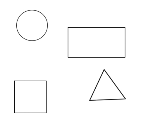
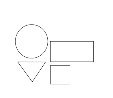
As you can see, they are unrelated and there is no movement at all. However, if we make a few adjustments, put them together in an artistic manner, then we have a more coherent arrangement. Something that goes like this:

Fig. 2 Posted by Picasa


Remember, when doing a bulletin board, a poster or anything that calls for a visual presentation, always consider how you are going to put the various parts together. To do this, we must bear in mind the concept of balance. There are two types of balance in art. The first one is called Formal balance. This is when all the elements found at one side of the given space is also found at the other.

Fig. 3 Formal Balance Posted by Picasa


This type of balance is very safe for there is already symmetry. However, sometimes, this can be boring to look at. This brings us to the next type of balance which is called Informal balance

How is this done? Just like when two people of different weights ride a see saw, either the heavier one or the lighter person adjusts so that the seesaw will have a good equilibrium and they can enjoy the ride. This is what a good artist does. Find a "feel" for balance. There are some rules which we can follow. I can give you one. Remember, a big white object will balance several dark smaller objects. Hence:

Fig. 4 Informal Balance Posted by Picasa


If you see a photograph where all the elements are placed on the right side, don't you feel like they are falling off from the frame? That is because it has poor balance.

Lastly, consider patterns when making a design. you can use three basic patterns. These are, repetition, (aaaaaaaa), alternation (ababababab) and alteration.

Fig. 5 Pattern Posted by Picasa


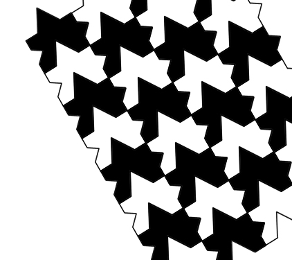
Since my son (feel free to browse through his works) is already sleepy and it being a school day, I had to free him from helping me. Thus, using the same example, imagine that all the shapes are in white, that is repetition. Since I asked him to make it black and white, the pattern is alternation. If say on the space at the left of the picture, I created a red circle, then I would have altered the pattern, hence such will be alteration.

Lastly, one can use the rule of thirds. How this is done is by dividing the drawing or working space into three parts horizontally and vertically like so:

fig. 6 Rule of thirds  Posted by Picasa


The intersections are the most interesting spots where you can put your subject. Simple, right?

For a much more detailed lesson, you can go here and here

Saturday, August 13, 2005

Design 1

I will have to thank my son, Mickey, for patiently doing the images I present in this entry. As you see, it took him only a short while to do what I would have done in ages accompanied by almost bleeding to death, pouncing on my head and throwing the entire computer to the ground out of dismay.

One of the tasks given to teachers is the preparation of the classroom especially during the opening of classes. Not only that, they would be given assignments to display works of students, and occasionally design a bulletin board. What about those visual materials they have to prepare to aid the teaching of the lesson and hype it up a notch? All these require some knowledge in design, at least to a conscientious teacher, that is. Of course, one does not want to make sloppy work. Being an art teacher, I have been requested to do these things not only for myself but co-teachers as well. Since i am maintaining a blog and have not been inside a classroom for quite some time, I decided to share my little knowledge which I think would be most helpful to those facing the task of having to make a design for the school or even for just a class.

Allow me to start this off with color. Color is very important. When making a design, the important thing to remember is that it should be pleasing to the eye. Colors one must use should harmonize with one another. Often, you hear someone quip, "Somehow, the colors don't match!" When you hear this, you know that you failed to harmonize. There are people who have a knack for color. They have a good color sense. But what about those who don't? Don't despair for there are certain standards which we can follow so that we can never go wrong with our color choices.

Hence, I introduce to you the Prang Color Wheel. This is a device designed by Mr. Prang to guide us with color combinations. This is how it looks like:

Posted by Picasa
Fig. 1


So, okay, now that you know that there is a color wheel, so what, you ask? The name of the colors as we know them, ex, red, violet, magenta, are called hues. Allow me to dissect this color wheel a bit. Let's start off with the very basic. We have three primary colors, viz., yellow, red and blue. These are called primary because these are the sources of all colors. We cannot produce these colors by mixing two or more colors. They are what they are. Let's present them in a triangle. Hence:

Posted by Picasa
Fig. 2


Now, what happens if we mix equal parts of two primary colors? Yes, we get secondary colors. These colors are orange (the mixture of red and yellow), violet (blue and red) and green (yellow and blue). Again, we can form a triangle to represent them.

Posted by Picasa
Fig. 3


Now, let's make it even more interesting. What about mixing one primary color with a secondary color? Of course, we get a tertiary color. Some people call them intermediate colors but just for the sake of simplicity, convenience and consistency, let's call it tertiary. Now, the wheel is complete. No, not really. We can still go in-between these colors but I'll let you do the imagining from this point on.


Posted by Picasa
Fig. 4


I can almost hear you saying, "So what? Fine, now I know there exists a cute arrangement of color. But what does it do?" Here comes the important part. There are various ways by which you can use this color wheel. From this, we derive proper color combinations artists call color harmonies. Again, I am going to present to you the very basic of these color harmonies.

First one is called MONOCHROMATIC color harmony. Mono means one, ergo, choose a color and by either adding white or black, lessen or increase the intensity of the color.

Here, I have made five different "shades" or "tones" of one color. So, if you have a drawing of say, a landscape, use these different tones to create a painting. Divide a drawing into several parts. Assign a number to each of the tone. Set aside. Put numbers on the segragated areas making sure no two area of the same number sits side by side. Apply the tone to the numbered area and there you go! YOu have made a monochromatic painting of a landscape.

Next one is called analogous harmony. Analogy means relationship. Thus, these are colors that are related to one another. Take a look at the color wheel again. Notice that colors to the left of yellow and violet viz., YO, O, RO, R, and RV come from one primary color which is red. On the right side, YG, G, BG, B and BV, the common color is blue. See the relationship? The colors to the left of yellow and violet are called "warm colors" while those to the right are called "cool". I shall let you decide which set would be suitable for what design. Just like the monochromatic harmony, what you can do to a drawing is segregate the areas into five to six numbers and assign each area a number. Apply the color and voila, you have a painting that uses analogous harmony. So, you ask, "what are yellow and violet? Cool or warm?" They are neutral colors!


Color Harmonies Posted by Picasa
Fig. 5


Lastly, we have complementary colors. These are colors that lie opposite each other. They are called complementary because they somehow complete the color wheel. What do I mean? Remember how the colors are related to one another? Those in left being related because they all have a portion of red. However, they do not have any blue! So, in order to complete it, get the opposite color. Hence, orange and blue are complementary. So are red and green. Can you think of a season where the color harmony is predominantly red and green? In the example, I have made yellow and violet slightly bigger to show you how they lie opposite each other.

Posted by Picasa
Fig. 6


There are other ways by which you can use this wheel. For example, there is one called "split complementary" where you combine yellow with Red Violet and Blue Violet. As you make your works of art using this wheel, you will realize that tt's worth the trouble experimenting with color. i don't want to spoil your fun so this is where I get off and leave you to have your fun.

Sunday, August 07, 2005

I've been tagged!

This is my first to do this. I have been tagged before but for one reason or another couldn't oblige. Sorry guys.

Anyway, I've been tagged by Eruannie a co-member of pinoy teachers network. She's a teacher, storyteller, writer who works as a librarian in one of the best schools in Manila. So, what do you think is the meme about? Books, what else!

So, I'm supposed to enumerate 5 books that I love and own. Hmmm... That should be easy as I stopped buying books when prices skyrocketed. I get my reading materials from the school library and borrow from friends. Anyway, the books that I love and actually have are:

1. The Little Prince by Antoine de St. Exupery - So simple and unassuming and yet very powerful.

2. Jonathan Livingston Seagull by Richard Bach - gave me the idea that nothing is impossible.

3. The Covenant by James Michener (I can't find this one anymore as the others, like Hawaii) - tells about the history of South Africa in novel form. I've read Chesapeake, too, but I just borrowed it from the library.

4. Shogun by James Clavell - Bought this from a dollar store in Steveston. I've always been fascinated by Japan and the Japanese culture. Incidentally, I've also read King Rat, Tai Pan and Noble House.

5. Dude, where's my country by Michael Moore - this one's a present from my niece who came for a visit from the States. She also brought me Ron Suskinds's The Price of Loyalty. Interesting how Michael Moore put the pieces together.

Additional:

6. Atlas Shrugged by Ayn Rand - this one I have to keep in balance as I might turn out to be greedy. Also had The Virtue of Selfishness and even wrote about it here

So there, that wasn't really hard. Anyway, I am beginning to like Neil Gaiman. i've heard so much about him from bloggers especially from friends in blogkadahan who are big Gaiman fans like Batjay, Doc Emer and Joffin. With people of this caliber saying something, one better listens, right? And they're so right! Neil Gaiman is one hell of a writer. Finished reading Coraline and reading American Gods and loving it.

-------------------------

Btw, can someone explain to me what happened to my site meter? It had 38000 before until I realize I've lost it. The next time I saw it appear, it was back to two hundred and counting again? Weird. Has this happened to anyone yet?

Monday, August 01, 2005

God Bless you Ben Stein

It is with deep regret that I have not been blogging and bloghopping the past couple of days because I had been very busy with work. Much to my regret, I missed this post of my friend The Cat where she featured an article written by Ben Stein, which he claims, would be the last article he would write for his column "Monday Night at Morton's" after seven or eight years of writing it. The column is about a steak house called Morton which is supposedly frequented by movie stars. However, I am still in luck for another blogging friend, actually, idol, Sassy emailed the same article to me.

I have seen Ben Stein in a couple of shows before. There was this trivia quiz I regularly watched in Canada while seated on the couch and trying to answer the questions before the contestants gave out the answer. The idea was whoever won the match would pit it out with Ben Stein and grab his money. I forgot the title of the show. Then, I've seen him at Fox News giving his opinions on economic issues, and lastly, at that talent show hosted by, I think, Arsenio Hall. Yes, Ben Stein might be uninteresting on the surface, with that inanimated voice and sleepy stance on tv but he sure is smart. Now that I've read this article, I came to realize he's even smarter than I thought he is.

Anyway, in this article, we see how Ben Stein got to an enlightened realization that while it is true that society may not have changed looking for heroes, it has changed its criteria through time.

Beyond that, a bigger change has happened. I no longer think Hollywood stars are terribly important. They are uniformly pleasant, friendly people, and they treat me better than I deserve to be treated. But a man or woman who makes a huge wage for memorizing lines and reciting them in front of a camera is no longer my idea of a shining star we should all look up to.


He talked about how he shifted his ideas of what constitute heroism from these huge money makers to the ordinary soldier in Iraq, the policemen and firemen and women who will put their lives at risk without fear for life and limb just so the citizens of the world can live peacefully and happily.

Real stars are not riding around in the backs of limousines or in Porsches or getting trained in yoga or Pilates and eating only raw fruit while they have Vietnamese girls do their nails. They can be interesting, nice people, but they are not heroes to me any longer.

A real star is the soldier of the 4th Infantry Division who poked his head into a hole on a farm near Tikrit, Iraq. He could have been met by a bomb or a hail of AK-47 bullets. Instead, he faced an abject Saddam Hussein and the gratitude of all of the decent people of the world.


What do I make out of this article? Why the interest? There are two things I want to point out here. First, the article moved me for I feel the same thing. Why do people look up to these so called "stars" making them ultra rich while thousands of people out there are sacrificing their lives for a measly sum? What kind of values do we have? Then that made me think this may be one of those perks of capitalism. The more money you have, the greater you are. Nevermind how wealth is attained. As long as you have plenty of it, you are worthy of emulation. This makes you realize how parents would make their "talented" child stand long hours in a queue to audition for a role, or a kiddie contest in a noontime show. The "return of investment" should the child succeed is staggering!

Second, can we say that the average Filipino cop worthy of our adulation? What with all the bribery, the corruptness and sometimes, the lack of intelligence that seems to plague policedom in the country today. What about firemen? We have heard how these firefighters would, holding his waterpump, stand guard on the richest guy in the neighborhood simply because he was promised a reward, or the looting that took place during a fire. Do I dare mention politicians? So, who do you think would be our heroes? I am tempted to say teachers but that would be self-serving. I'll let you be the judge.

What I do know is that I envy Stein for he has found his true heroes. Can we say the same thing if ever we wanted to have a paradigm shift in choosing our heroes?


You can read Ben Stein's article here